Tuesday 18 December 2012

Experimentation


I created this by creating a bright vintage effect on photoshop. I am thinking of experimenting this technique on some of my own photographs.

Saturday 24 November 2012

Mimi Chakarova


Mimi Chakarova is a documentary photographer who was born in Bulgaria which then she migrated to Baltimore as a teenager with her family in 1989. She felt alone and out of place which then she was desperate to find a niche. She saved up some money which then she purchased a camera and found a love of capturing photographs.

This is a photograph of a guard in Kashmir with children all looking at him. This image appears to have a meaning behind it, it could represent how in Kashmir their is so much violence that the children all look up to the gun in disappointment as if its a normal object to them. The children's facial expressions play a big role in this photograph as it sets a kind of dull depressing mood. A journalist quoted  "I was in a bus when I saw a man shot dead on the road. People passed by. Further down the road, I saw a dog that had been run over by a car. There was a group of dogs gathered around his corpse, mourning his death. What does this say about us?" this means that in Kashmir people killing each other is a normal thing and there is no love or care at all for each other where as the dogs still care and love each other even though they are lower than the people. The children appear to be standing away from the guard which could indicate that they don't want to get involved with the situation and are disgusted by the way they kill other people like it is an every day occurrence.

My first initial thoughts towards this photograph were that it looked gloomy, serious and had a kind of negative feel to it. The use of the grey brings your attention to the subjects of the image and not so much on the colours used. I think the photographer was aiming to make the audience look at the image from a child perspective as it is on the same level as the children but you can only see the waist of the guard. The image also looks quite old like it was captured with an old film camera, this adds a interesting effect as you can tell the background is in a third world country.

I admire this type of photography and like the way the image is simple but has such a deep meaning behind it. The colours used a basic and bland but I think the colours used play a big part in setting the mood. I like the way she has captured the guards waist with the gun as the subject and has slightly blurred the children in the background. I admire this technique and I am considering using it myself for my own photography work.

Tuesday 13 November 2012

Personal Project


For this project I am required to use all the skills I have gained and create a final outcome that is sophisticated and professional. I have to research into a number of artists and look for inspiration to create my project.


Wednesday 10 October 2012

Final Evaluation

For the enhanced Image project I was given a choice of themes that I could base my project on such as fashion, contemporary, Landscape, Portrait and Documentary. I decided to choose the documentary theme as I found it most appealing and I could have the freedom of experimenting with a wide range of ideas. I was required to experiment with a number of digital and darkroom print based outcomes so that I could widen the range of outcome ideas. I also researched into a number of photographers based on my documentary theme that I could gain inspiration from.

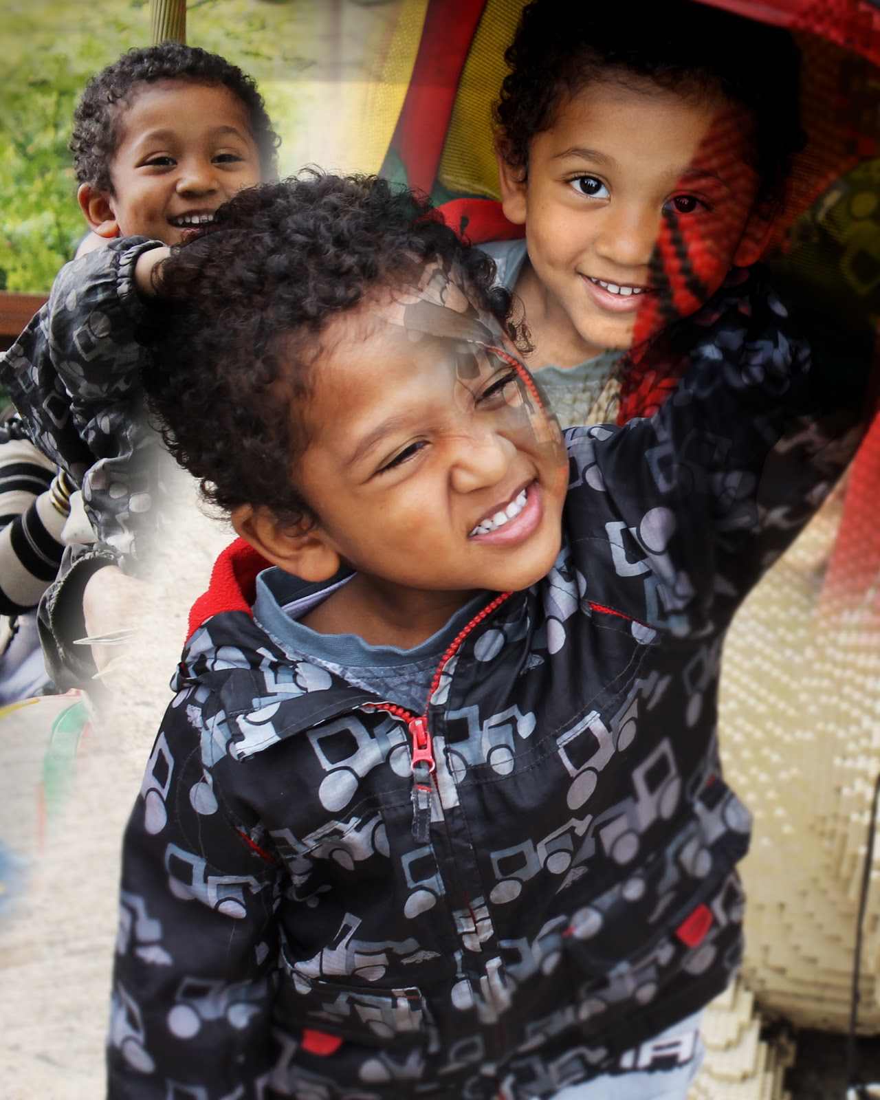
I started off with 4 ideas which were based on children, animals, historic landmarks and London. My main plan was to develop the idea of children as I have a younger sibling and many younger cousins so I could take a load of pictures to work with. I then broke down the idea of children and thought of ideas that I could incorporate within in theme such as children at school, children playing, children experiences etc. I decided to develop the idea of children's experiences where I then documented my younger brother on his first ever trip to Legoland. I photographed him in the action as I wanted to catch his facial expressions and moods so that it felt like a real documentary theme shoot rather than a portrait shoot. I captured images of him on rides, walking around, things he was looking at etc. This was a very successful shoot as I captured a broad range of photographs that I could work with for my experimentation and for my final outcome. Another theme I captured was my younger brother playing in the snow, I liked this idea as it was a change of scenery and lighting was very good as the snow made the images brighten up.

For the experimentation part of the project I started of doing some handmade experiments with materials such as acrylic paint, ink, food colouring etc. I enjoyed these but I felt that they weren't techniques I would like to use for my final outcome I wanted to concentrate on creating a clean cut neat outcome. I then moved on to the digital experimentation which my main idea was to use the double exposure effect. I began to use to images I had captured and used photoshop to create a double exposure effect so that I could create a montage kind of big image. I felt that using the double exposure effect would make the images look like they have a story behind them and it would feel like a big board of memories.

I researched into a number of photographers but the main person that gave me my inspiration was Dan Mountford who is a documentary photographer. I admired his photographs as he used the double exposure effect which made each one have a hidden story behind them. His pieces looked very simple and had no colour but still they looked like deep images and they inspired me to base my own work around his.

For my final outcome I came up with a few ideas such as mounting images onto foam board to give it a 3d raised effect but I then decided to keep it more simple and classy. I used the vignette effect on the best 5 images I captured and then for the final main piece I created a kind of double exposure collage of all the images put together. I was proud of my outcomes as I got them professionally printed so they had a clean sleek finishing look to them.

Overall I was fairly satisfied with my progress and outcomes but feel I could of done better. I could have came up with more ideas and developed my original ideas more in depth. I could have experimented more with the outcomes and incorporated some hand made designs within the digital to make it more interesting.

Tuesday 9 October 2012

Review of Experimental Work

Since I began the project I have experimented with a wide range of techniques and presentation techniques to give me a variety of possible final outcomes. Throughout the As-A2 Project I completed experiments such as Origami, pinhole technique and weaving two photographs in and out of each other. These experiments were new to me but were very enjoyable, they gave me more ideas that I could use for my final outcome. Since then I have experimented with more creative handmade techniques such as the Leslie David paint experiment where I printed out photographs and used acrylic paint to make them more bright and eye catching. 

While I experimented with these techniques I also shot my first roll of film. My theme is Documentary so my photographs were based around documenting people. I captured photographs of people doing certain facial expressions to give the impression there was a meaning behind each photograph, I also photographed peoples shoes and things on them like id cards to symbolise things about them.


I also experimented with techniques on photoshop which I prefer and felt comfortable completing. I used the double exposure effect tutorial on photoshop where I combined two photographs together to make an interesting outcome. I also used the vintage effect on one of my photographs to give it a dark shadowy outline so the focus is mainly on the middle of the image. I was successful with these experiments and I am considering using them in the future with my final outcome ideas. Another effect I accomplished was the solarisation effect. 


I experimented with a lot of darkroom work such as dodging and burning, creating negatives from scratch and using shapes to highlight certain areas of an image. I found the darkroom work more difficult but it was enjoyable at the same time, I was successful with the experiments and my prints came out with some interesting effect and textures. I am considering using some of the darkroom techniques when developing my roll of film.


The artist that inspired me was Dan Mountford who specialises in double exposure photography. His work amazes me by the way his images tell a story and the way the two subjects shadow one another. I am incorporating my work around his technique.

Monday 8 October 2012

Double Exposure


This is a photoshop experiment I created using the double exposure technique which consists of overlapping two images to create a see through effect. I am going to be using this technique for my final outcome and I think it can tell stories and have meanings behind the images.


This is another double exposure experiment I created on photoshop using toy army men. I used a shadowed image and a light contrasty image which I then overlapped them to create this interesting effect.

Friday 28 September 2012

Multiple Exposure


These are some multiple exposure experiments I created with some photographs I captured.

Thursday 27 September 2012

Leslie Davis Experimentation


This is some leslie davis experimentation work I did on some photographs I capture of the London eye and of a model. My aim was to make the picture stand out and be colourful. I aimed to overpower the image with these colours so that the audience are concentrating on something else. To get this effect I used acrylic paint and cut out a piece of cardboard where I then spreading the paint across the photograph blending the colours together. I also used different objects to do different shapes and patterns.

Solarised photographs


These are two images that I used the solarise effect on to give them a dark contrasty gritty appearance. I enjoyed using this technique and would consider using this technique in the future. The top image is of a photograph I captured of a BMX stunt rider at a skate park in south bank. The second is a documentary photograph of a young child soldier.

Assessment sheet


1. The target I am going to achieve is to complete more experimentation and capture more pictures.

Monday 17 September 2012

Photographs


Vignette Effect Experiment


This is a photograph of a Lego soldier that I photographed in Lego Land. I created a Vignette effect by isolating a section using the gaussian blur effect then reducing the vignette amount to create the dark area around the image and leaving the centre lighter.

Sunday 16 September 2012

Leslie David


This is a piece by Leslie David a Graphic Designer and Illustrator from France. She grew up in the south of france in a small village called Sauzet. Leslie works for high profile clients across the world and has a very impressive body of work. Her style of work would come under the Landscape category as most of her photographs are of landmarks, streets and buildings. This work was created as a post card, her aim was to make the photograph reminiscent of the horror film Blob from the 1950's. I have chosen to analyse this photograph because it is eye catching and the technique used looks very interesting and creative.

I would associate this artist with the Landscape theme, reason being is because all of her work is based around buildings and general landscape. I think the theme of her work is to create something different and random, her aim could be to combine two opposites such as a boring and exciting. I don't think this photograph has a specific of deeper meaning to it, there is no indication of emotion or any kind of story behind it.

The materials used were fluorescent paint and old postcards. The technique she has used is simply spreading the paint over the postcard to make it look like the colour is over powering the plain black and white post card. I think this is an effective and strange technique by the way it has no structure to it but still serves its purpose. The paint breaks up the normal image sort of like it has been set free. She uses a range of bright colours mixed together such as pink, yellow and green. The choice of colours remind of hippie colours which could represent hippies brightening up boring plain landscapes.

I have chosen this photograph because the technique used and also the whole theme of it interests me and makes me think about what the artist was thinking when creating this piece. My first reaction was quite confusing and I didn't understand what the image was about as it has no structure to it what so ever. I like the way the plain colours clash with the bright colours to create an effect, it looks like the colours are slowly infecting the image and over powering it to make it more exciting. The only thing I dislike about this image is that it is confusing and it is hard to find a meaning behind it or a story behind it. I have never come across an artist that does uses this technique specifically, I have come across certain artists that have the same intention which is to clash colour with plain. Leslie David inspires me with her creativity and technique, I am interesting in looking further into it and also experimenting with it myself.                                                                 

Suzy Allman


Suzy Allman is a New York based editorial photographer that shoots Sports photography, travel photography and also Portrait and Landscape Photography. She has done a lot of work for the times newspaper, american express and also a lot of magazines. Suzy holds a degree in Environmental Science from Macquarie University in Sydney Australia. This piece has been presented in exhibitions much like her other photographs. This image is different from her usual sport photography as its less obvious and tells a story kind of like documentary/portraiture photography. The title of the piece is from Tennessee Williams 'Luxury is the wolf at the door and its fangs are the vanities and conceits germinated by success. I have chosen to analyse this piece because it relates to my theme that I have chosen and also the technique she has used I would like to experiment with and use myself. I have also been looking at other photographers that use this technique such as Dan Mountford.

The genre of this photographers work is mainly Documentary as she documents a lot of events. For this photograph she has included the Documentary theme with also some Portraiture elements also. I think the theme of the image is the female opening up her thoughts and what she feels inside. Suzy Allman has used the double exposure technique to merge two images together to create an interesting effect. I think the meaning behind this image is that the female in the photograph has had past experiences in that house that she is letting out which is represented by the door being opened. She is also smiling which could indicate happy thoughts.

She has used the double exposure technique to isolate part of the image and put something else there which has worked very well. Suzy hasn't used any editing methods such as photoshop the photograph was captured as it was. The uses of colour are very plain but this is one of the most important aspects of the photograph. The grey and black theme creates a serious and meaningful aroma about the photograph and makes you feel like there is an emotional side to it and there is more to it that meets the eye. The dark and faint colours make you concentrate on the image more in depth and make you think about what it could mean. The photograph looks like it has been produced in a dark room and it quite contrasty.

I chose to look at this work because I have been looking into photographers who specialise in this type of documentary double exposure photography and this image inspired me. When I first looked at this photograph many questions came into my head like what is it the female is doing, what the door opening represents, what the meaning of the image is etc. I like the way she has used the double exposure technique and also the contrast and definition of the plants in the doorway. I have seen another photographer create very similar work to her called Dan Mountford who also uses the double exposure technique. This work has inspired me to base my own work around this technique and experiment with it.


Dan Mountford


This is a photograph by the English Graphic Design student Dan Mountford. He is a twenty one year old student studying in Brighton, Dan currently works in photography, illustration, editorial and motion design. This piece he has done was photographed with a double exposure technique that he uses a lot in his work. This photograph was presented in an exhibition amongst many others that Dan Mountford has produced. I have chosen to analyse this Dan Mountford's work because his technique of double exposure interests me and I am very eager to try it out myself. I admire the way his work appears to have stories and meanings behind them.

I have researched into this image and also why Dan Mountford uses this technique which he calls 'The world inside of us'. He describes it as a visual journey through our minds by calm and tidy means which the reality of everyday life does not show. He isolates parts of an image with no assistance at all from photoshop. I would class his work as a Documentary/Portrait theme from the way he captures clear portraits of people plus the way he involves images that have meanings to them kind of like he is documenting something about that person. The title of the work relates one hundred percent to work itself, from the photograph you can see 'the world inside of her' which is the impression he wanted to portray.

This piece is a photograph captured with double exposure, he has used no photoshop at all or any type of editing techniques. He isolates parts of the image successfully which makes them captivating and thoughtful. He used just black and grey in his photographs which are boring colours but the photographs are boring in no way what so ever. The black and grey theme give the image a mysterious look and a more serious and emotional feel. I think the colours play a big part in influencing the audience as it makes you think about what the image is trying to say and what the meaning behind it is. 

I chose to look at this image because from the first glance I took at it, it left me with a lot of questions in my head about what story he was telling behind this photograph. I admire the documentary theme a lot and also I admire Portrait photography. I like the way the girls face is filled with that seaside theme, she could be reminiscing about the place in the background as she is slightly smiling. This work has inspired me to experiment with the double exposure technique and also involve a meaning behind my photographs so that the audience have something to think about.


Tuesday 11 September 2012

Mood Board


This is a mood board I created of the work of different photographers. I have made a page of the links where I collected these images from and also named the photographer under each image.

Thursday 6 September 2012

The Enhanced Image Project

This is the Enhanced Image Project brief. My ideas are going to be based around the Documentary theme.


Wednesday 22 August 2012

Oragami Holiday Homework


These are some pieces of origami that I created of a Butterfly and of a Dove. They were interesting and fun to make and I would consider doing it again to make more creative things.

Thursday 16 August 2012

Photograph Weaving Experiment


These are two of the same photograph one with colour and one without. I cut both photographs into strips and then weaved them into each other creating a checkered pattern.

Pin Hole experiment


This is an experiment I created by poking holes into a photograph with a needle. I then put the photograph in front of a bright light source which then the light shined through the holes creating that effect.

Monday 2 July 2012

Animated Gif


Geraldine Georges


I created my own Geraldine Georges image by using an image of my little brother and cutting parts out and using colourful ovals and different textured paint brushes.

Geraldine Georges


These pieces were both created by Geraldine Georges, her speciality is combining the art of photography and illustration together to create these amazing images.

The first image is of women that are merged together to create a creative effect of making it look like the body of the women fits in to create her face also. The first thing that came into my mind when i looked at this image is the way women are stereotyped and that they don't really have the authority to speak out for themselves, this can be represented by the way the bottom halves of their mouthes are cut out. Woman are seen to be in the kitchen and aren't really able to express themselves which is represented by the way parts of her face is cut out and her eyes are pitch black which make her look like she has no soul or liveliness to her life. Also it shows parts of the woman's body with no clothes on which could represent women as being sex symbols and their physical image being more important than their personalities and mind.

The top right image is very similar to the previous image but this one has more colour included. Again when i looked at this image the stereotype of women straight away came into my head from the image of the make up and flowers. This image could represent how women concentrate on making themselves look better by applying make up and colourful essentials to their faces to change their appearance. The flowers may indicate that women are soft and gentle human beings but again showing that they are inferior from the way their mouthes are partly cut out which represents them not being able to speak out for themselves.

The artist has used a fine liner pen to draw around the images to make it stand out and combine the illustration with the digital photography so you get the best of both worlds.

I think that artist decided to use this technique to show her opinion on women through a more effective and creative way which would touch and have a connection with the audience.

The third image is of a dull street which looks like the photograph was captures many years ago. The artist has combined the art of illustration and photography to make it look like the two worlds have merges together creating a realistic but creative image. The thing that came to mind when i looked at this piece was humour brought into a serious scene. The street looks dull and everything on it is in black and grey which looks boring and lifeless. The animated people and objects like the balloon stand and lamp posts are still dull coloured but make it look more humorous and interesting. It is also quite surreal how the animated figures are around the human figures and everything is going on normal like its an everyday thing.

I think the artist chose to use hand drawn illustration with photography to create a surreal picture and to make it look interesting and original. I admire the use of humour in this piece as the woman holding the dog leash that seems to be slightly longer than usual, also the man walking casually along the rope between the two lamp posts.

Norm Magnusso


These are photographs of the work of Norm Magnusso. The project is called decorating Nature and as you can see that is exactly what he has done. He has used paint to decorate leaves, twigs, pine cones etc and has made them colourful and creative. He uses his environment and surroundings as his canvas for all of his work.


I created my own Norm Magnusso pieces by using leaves and using acrylic paint to make them colourful and make some sort of pattern on them. I then put them into bushes to make it look like they was already there and create a natural but un-natural look.

Jan Von Holleben


This is the work of Jan Von Holleben. He was born in 1977 and was raised in the southern German country side. At the age of 13 he was influenced by his fathers photographic work and then decided to follow him by starting to experiment with photographic magic tricks to then develop his own technique.

The images above are of his work which he has created a creative and amazing effect. In the first image he has used materials like a blue sheet, socks and plants to create the scene of a boy scuba diving down and finding treasure. The boy is actually lying on his side and Jan Von Holleben has taken the photograph from above which makes it look like actual under water scenery.

The image below that is of children riding bicycles. Again all the children are on the floor and the bikes also where he has then taken the photograph from above making it look like they 
are actually riding bikes.


This is my own Jan Von Holleben creation. In a group we decided to create a bed time dream theme and then pretending to sleep in it. First we laid down two large black sheets to represent the dark night sky, we then cut out stars and 'z's which represents us snoring. We then laid out instruments to represent the bed time nursery rhyme 'the cat and the fiddle'. We then made a bed out of more sheets and used big pieces of wool to make the pillows, we then all got under the covers and pretended to sleep which then a photograph was taken to create the effect of a dream.

Markus Kison


Markus Kison is a digital art based photographer based in berlin. He uses the technique of cutting certain parts out of photographs and makes them appear like they are 3D and coming out of the actual image. He changes the digital layers into physical layers.

Above are two of his pieces, the first one he has created an effect that makes it look like the man in the image is actually walking on top of it. He has created a shadow effect also behind the man by cutting out the outline of him. The image below that is of two people having a conversation, again he has made it look like the people are physical and coming out of the image.