Friday 10 May 2013

Final Exam Evaluation

At the beginning of the project my ideas ranged from hand made and digital techniques and they ranged from a load of different themes. The main theme of the project was inside, outside and in-between. My first main idea was to focus on every day life and photograph things in the house and things that are always there but you don't really notice them like in-between the sofa or inside a cupboard etc. I then came up with an idea based on inside vehicles and photographing the outside world from inside which linked to the exam theme. Over time my ideas developed and changed and I got rid of some ideas and developed the ones I thought would be the best and most successful. Another idea I came onto was signs and messing around with signs in weird places. I liked this idea a lot as it was funny and different, I enjoyed the thought of bringing humour into my work. I developed this idea over time and started to photograph signs and create my own. This linked to the exam theme of inside, outside, in-between as I put the signs inside places and outside and also in-between places.

My ideas were influenced by Lee Friendlander and David Shrigley. Lee Friedlander inspired me for my first idea which was photographing from inside of a car and capturing the outside world. His black and white documentary photograph gave me inspiration to try out his technique and make it into my own style and expand on it. David Shrigley gave me the most inspiration as he inspired me on the funny signs idea. I used his technique and tried to relate my images to his as much as I could and make them humorous. The trip to the exhibitions inspired me a lot and gave me new techniques and ideas that inspired me for my final piece. The photographer that inspired me the most was David Shrigley as his work related to what I wanted my final outcome to be based on.

I completed a range of different experiments from hand made to digital where some were successful and some were not so successful. I enjoyed the photoshop experiments using my own images which was my strong point. I also completed some experiments in the dark room which were successful but I preferred using computerised techniques. I felt to make my outcome hand made as it was different and I haven't done it before so I stuck with it.

Overall the project went well but it had its ups and downs. I switched between different ideas and couldn't make up my mind but I decided to go with the signs idea. The exam theme was very flexible as it allowed me to work with what I wanted to do and let me create what I wanted to create. For my final outcome I cut out the word 'SIGN' and wrapped images of signs around each letter so it appeared to be inside the word. I was pleased with my outcome but there is room for improvement. Overall the course went well. I enjoyed the prep work and looking at different techniques and building up my ideas slowly which led me to create my final piece.

Tuesday 16 April 2013

Photograph edits


These are some edits I created using the photographs I captured in Brighton. I adjusted the contrast to make them more clear and I made them all black and white. I decided to pick a subject of each image and made each subject its normal colour so it stands out in the picture. I decided to do this because I wanted to make the things people don't really notice to be noticed in my photographs. I like this technique a lot and will be using this for my final outcome. For the middle two images I decided to make them contrasty and all black and white so you can concentrate the whole picture rather than specific sections.

Darkroom Prints


These are some photographs I developed documenting someone doing their work. I was quite pleased with these images as they came out contrasty and clear. I attempted the double exposure technique with two negative which created a interesting effect of making it looking like there a smaller person sitting on the bigger persons lap. I created a contact sheet showing all of my negatives also.


Monday 15 April 2013

Photographs


These are some photographs I captured during my trip to Brighton. My plan was to photograph things that you don't really notice and focus on. I gained my inspiration from Chris Connolly and decided to base my photographs on his techniques and style.

Thursday 28 March 2013

Signs Mood board


This is a mood board I created of humorous and silly signs. I like this idea as it messes around with normal things you would walk past in the street. I am going to be making signs like these myself and putting them in different places.

Hand Made Experimentation


These are some hand made experiments I created in a group. On the first one we cut up a picture of a map and then made a video putting all the pieces back together. On the second video we ripped up a load of different pictures and photographs where we then scattered them on a big sheet of paper and squirted paint all over them to make it creative and messy.

Monday 18 March 2013

Juergen Teller


Juergen Teller (born in 1964 in Erlangen, Germany) is an artist and fashion photographer.
Teller entered the London photography scene through the music industry taking photographs for record covers, it was Teller’s photograph of Sinéad O’Connor for her single Nothing Compares 2 You that marked an important moment in his career. Teller’s photographs first appeared in fashion magazines in the late 80s, and included portraits of Kate Moss when she was just fifteen years old. Teller’s images could be described as the antithesis of conventional fashion photography seen perhaps most markedly in his campaigns for Marc Jacobs.

This is a photograph for a Marc Jacobs ad campaign spring summer 2008 that Teller created. The image is of victoria beckhams legs hanging out of a Marc Jacobs bag. My first initial reaction was that this image could have a meaning behind it and it could be a sexual meaning by relating his other work around the gallery to this image to. Firstly it is not obvious that the female is victoria beckham, it just appears to be a random ladies legs. This could symbolise that Marc Jacobs products and the things that come out the bag symbolise being able to have access to a ladies body. Another theory could be that it could represent a women giving birth in style from the shoes she is wearing, usually when a woman gives birth the child is seen as a gift from God, so her legs being parted on either side could represent the product being a gift from God as it is coming from inbetween her legs.

The picture looks very clean cut and proffessional, the main colour is white and black and the white background gives it a clean cut look. I think the shoes and the tanned legs are effective as it draws your attention and makes you focus on it. The image looks natural and raw and not much editing has gone into it, this is a good effect as it doesnt take away the realism of the photograph. The shoes in the image look luxury and of an upper class which makes the brand Marc Jacobs seem like an expensive brand.

This photograph is inspiring and Juergen Tellers work is strange and not really my style of photography but his technique of using two cameras is effective and interesting. I like the meaning behind this photograph and the fact that we dont know it is victoria beckham it gets the audience thinking. I especially like the realism of  this picture and the rawness.

Monday 4 March 2013

Experimentation


This is an experiment I created on photoshop where I cut out the mountain and filled it with a photograph of cars on a main road. My aim was to combine two images together and create a strange but interesting kind of image. I could have improved this experiment by maybe using a more obvious subject and linking the pictures together. My aim was to combine city life and life away from the city. I think it worked well but there is a lot of room for improvement.

Monday 25 February 2013

Photographs


These are some photographs I captured of different foods and things in my kitchen. I caught them from different angles and also different focus points.


Friday 22 February 2013

Lee Friedlander


Lee Friedlander, born in 1934, began photographing the American social landscape in 1948. With an ability to organize a vast amount of visual information in dynamic compositions, Friedlander has made humorous and poignant images among the chaos of city life, dense landscape and countless other subjects. Friedlander is also recognized for a group of self-portraits he began in the 1960s, reproduced in Self Portrait, an exploration that he turned to again in the late 1990s, and published in a monograph by Fraenkel Gallery in 2000. 

Made over the last decade and in a majority of the country’s fifty states, America by Car is a vast compendium of the country’s eccentricities and obsessions at the turn of the century. All of the approximately fifty photographs that comprise the exhibition were made from the inside of a car, most often of the rental variety. Friedlander transforms the car’s windows into deliberate picture frames.

Above are two of Lee Friedlanders pieces. My first initial reaction when I looked at these photographs were that they were original and simple but are very effective and powerful. I admire the detail and simplicity of the colours used. I especially admire the technique he has used of using his own point of view to capture the image. He has given us an insight on what he can see from his car window, this lets us see what kind of place he is in and what he sees on a daily basis. In the top image the cars seems to be the main subject of the photograph and it shows that this was taken maybe in the 70's. In the second image again there is a 70's style looking car but the main subject seems to be the tree that is in the centre. The way he has captured the tree in the side mirror and capture the tree in front is very effective as it looks like a smaller tree is forming into a big tree which symbolised the inside, outside and in-between theme.

The colours used are simply just black and white but these are great colours to use as it lets the audience focus on the imagery. The different shades of grey make the photographs look very old and vintage which adds a interesting effect. The images themselves are very dull but they are very inspiring and creative. This type of photography inspires me a lot and I am going to experimenting with these techniques for my own personal work.

Thursday 21 February 2013

Walker Evans


Walker Evans (November 3, 1903 – April 10, 1975) was an American photographer best known for his work for the Farm Security Administration (FSA) documenting the effects of the Great Depression. Much of Evans's work from the FSA period uses the large-format, 8x10-inch camera. He said that his goal as a photographer was to make pictures that are "literate, authoritative, transcendent". Many of his works are in the permanent collections of museums and have been the subject of retrospectives at such institutions as The Metropolitan Museum of Art or George Eastman House. Evans took up photography in 1928 around the time he was living in Ossining, New York. In 1930, he published three photographs (Brooklyn Bridge) in the poetry book The Bridge by Hart Crane. In 1931, he took photo series of Victorian houses in the Boston vicinity sponsored by Lincoln Kirstein. In 1933, he photographed in Cuba on assignment for the publisher of Carleton Beals' then-forthcoming book, The Crime of Cuba, photographing the revolt against the dictator Gerardo Machado. In Cuba, Evans briefly knew Ernest Hemingway. Evans accepted an assignment in 1936 to produce a magazine article on the conditions among white sharecropper families in the U.S. South during the "Dust Bowl". It was the time of U.S. President Franklin Roosevelt's "New Deal" programs designed to help the poorest segments of the society. Evans spent eight weeks that summer researching their assignment, mainly among three white sharecropping families mired in desperate poverty. They returned with Evans' portfolio of stark images—of families with gaunt faces, adults and children huddled in bare shacks before dusty yards in the Depression-era nowhere of the deep south.

My initial thoughts when I looked at this image was poverty in southern america. the scene seems to be a bedroom which looks very dirty, old and gritty. The people within the image appear to be a family of three and again they do not look clean and they seem to be living in poverty. The image has a slight brown tint to it which adds to the dirty, gritty effect and gives off a sense of poverty so you can feel it rather than just see it visually. I admire the way he has captured the image and the simple straight on angle, this shows the simplicity of the image and straight away you can tell that it is documentary style photograph rather than a planned photoshoot. It appears as if the family are doing what they do in their every day lives and they was not prepared for this image which makes it even more interesting.

There are no colours used at all except grey and the brown tinge that makes me image look very old and gritty. I think using no colour within the image is effective because it allows the audience to view the image properly and the things in it rather than different colours jumping out the image. The brown adds a serious feel to the photograph and makes it look more like a documentary style photograph.

I admire this photograph and admire Walker Evans work a lot by the way he captures a serious feel to his images. The brown tinge in the photograph adds a old gritty look which I admire also. This documentary style attracts me a lot and I plan to work with the technique and produce some of my photographs using this style.


Tuesday 5 February 2013

Mood Board


Starting Point


  • Why have you selected this starting point?
  • What are you planning to look at for primary/secondary research?
  • Which artists/designers will you be looking at (you must select a minimum of 3 from the theme)
  • What materials/techniques would you like to experiment with? 
  • Which experiment(s) are you planning to make?

- I have selected the everyday starting point because I feel I could come up with loads of ideas on this theme. I have always admired the theme of every day life and focusing on things we see in our normal lives that we tend to not focus on.

- For my primary research I will going to galleries and exhibitions to gain inspiration. For my secondary research I will be looking at artists websites and blogs.

- The artists I will be looking at are Man Ray, Kirsten Hoving, Pierre Cordier and Lisa Folina.

- I would like to experiment with a lot of digital photography work and computerised edits. I also want to try incorporate some hand made designs to give my designs some different attributes.

-  I am planning to make experiments with different materials and also create some montages.

Starting Point


  • Why have you selected this starting point?
  • What are you planning to look at for primary/secondary research?
  • Which artists/designers will you be looking at (you must select a minimum of 3 from the theme)
  • What materials/techniques would you like to experiment with? 
  • Which experiment(s) are you planning to make?

- I have selected the movement and light starting point because I feel that I can come up with loads of good ideas on this project and the different themes interest me.

- For my primary research I will going to galleries and exhibitions to gain inspiration. For my secondary research I will be looking at artists websites and blogs.

- The artists I will be looking at are Walker Evans, Lee Friedland, Wolfgang Tillmans and Cosmin Bumbut.

- I would like to experiment with a lot of digital photography work and computerised edits. I also want to try incorporate some hand made designs to give my designs some different attributes.

-  I am planning to make experiments with different materials and also create some montages.

Sunday 3 February 2013

Personal Study

Introduction

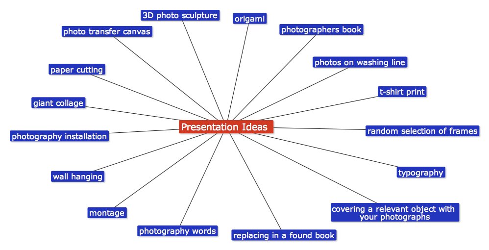
Throughout this year the main theme that has run through out my work has been 'Documentary' photography. I was required to photograph things related to the documentary theme such as people in their every day lives, events etc. I could either create an artistic outcome with the images I had chosen or have a mounted sheet of my best darkroom prints or digital photographs. The main structure of the two projects was to start of with initial ideas and then develop them into final pieces. Throughout the project I was required to complete a number of smaller tasks such as experimentation and research into a number of different photographers to gain inspiration.

Experiences and contextual research at AS level


Throughout my AS course I looked at a wide range of different work from individual photographers to exhibitions. I was shown work by a load of different photographers such as Andy Goldsworthy, Bill Viola, Geraldine Georges, Rankin, Pablo Picasso and Patrick Rochon. I analysed each photographers work and picked out the techniques that they had used so I could then experiment on my own work with them. The main photographers that caught my attention were Patrick Rochon and Rankin. These two photographers caught my attention from the way they used simple things we use in our every day lives such as a red pen and lights to create such amazing and interesting pieces. I also visited a museum and a photography gallery where I could see photographers work in the flesh and read about it. These all influenced me in the ideas I came up with and gave me inspiration on what kind of techniques I could use and gave me a broad range of different potential outcomes.


AS to A2 Project

For my AS to A2 project I analysed the work of Geraldine Georges where I gained inspiration and also experimented with her techniques on my own images. The main thing I was doing was completing hand made outcomes to get use to trying out new techniques so I could have a range of ideas for my final outcomes. I used a range of different materials and also experimented with using paint on different kinds of objects etc. The resources I used to look into the different types of photographers and work was mainly photographers websites, blogs and online exhibitions. The two main photographers that I liked most were Jan Von Holleben and Markus Kison, I admired Holleben's work because of the way he created images by playing around with different angles. I liked the way the images made me feel as if it was actually moving when it was a still image. Markus Kison again is a very interesting photographer, I admired his pop up technique as it made it look like the figures were walking out of the picture which was a very amazing technique. Both photographers work inspired me and showed me new and exciting techniques that I could consider using myself.

Enhanced Image Project

For my enhanced image project I was required to stick to my theme of documentary. I researched into two main photographers were I made some effective contextual links. The first was Dan Mountford, I admired his work because the technique he used was exactly what my aim was and the way the images made you feel was something I wanted my images to have also. The theme of his photographers related to my theme of documentary and each image told a different story which inspired me a lot. I looked into the techniques he used and researched into each image. I then used the technique on my own images where I took it further. The other artist I looked into was Suzy Allman, she again used the same technique as Dan Mountford but hers were more detailed and had more going on in the photograph. Her work inspired me as they also had hidden meanings behind them and it felt like she was documenting a story behind the image which is what I wanted my work to be about also. The presentation of the work appealed to me as they were simple yet effective. For my contextual links I used the photographers websites where I found out information on them and what their work was about. I heard about these examples from my teacher and from browsing on the internet. I searched photographers linked to the theme I was doing and thats how I came across these two photographers. I received a lot of advice and feedback from my peers and teachers on ways to improve my work and enhance it. My teacher introduced me to new techniques I could use to bring the best of my photographs out and also it inspired me on coming up with new ideas.

Personal Project 

My personal project outcomes linked to the theme I was using as it as about documenting which is what I was out to achieve. The contextual link I researched into was a photographer named Vasilisa Forbes. Her work influenced me in my outcomes and the techniques that I used to complete them. Her work was very basic but vibrant at the same time which is what caught my attention. I used her website as my research source to gain information and knowledge on her work and why she uses the technique that she uses. I heard about the contextual examples through blogs and forums talking about the theme of photography that I was doing. I received a lot of advice and took it all on board. I was given feedback on how to enhance my work and how to bring the best of it out. I was influenced to come up with new and more exciting ideas.


In Depth Comparison


Suzy Allman is a New York based editorial photographer that shoots Sports photography, travel photography and also Portrait and Landscape Photography. She has done a lot of work for the times newspaper, american express and also a lot of magazines. Suzy holds a degree in Environmental Science from Macquarie University in Sydney Australia. This piece has been presented in exhibitions much like her other photographs. This image is different from her usual sport photography as its less obvious and tells a story kind of like documentary/portraiture photography. The title of the piece is from Tennessee Williams 'Luxury is the wolf at the door and its fangs are the vanities and conceits germinated by success. I have chosen to analyse this piece because it relates to my theme that I have chosen and also the technique she has used I would like to experiment with and use myself. I have also been looking at other photographers that use this technique such as Dan Mountford.

The genre of this photographers work is mainly Documentary as she documents a lot of events. For this photograph she has included the Documentary theme with also some Portraiture elements also. I think the theme of the image is the female opening up her thoughts and what she feels inside. Suzy Allman has used the double exposure technique to merge two images together to create an interesting effect. I think the meaning behind this image is that the female in the photograph has had past experiences in that house that she is letting out which is represented by the door being opened. She is also smiling which could indicate happy thoughts.

She has used the double exposure technique to isolate part of the image and put something else there which has worked very well. Suzy hasn't used any editing methods such as photoshop the photograph was captured as it was. The uses of colour are very plain but this is one of the most important aspects of the photograph. The grey and black theme creates a serious and meaningful aroma about the photograph and makes you feel like there is an emotional side to it and there is more to it that meets the eye. The dark and faint colours make you concentrate on the image more in depth and make you think about what it could mean. The photograph looks like it has been produced in a dark room and it quite contrasty.

I chose to look at this work because I have been looking into photographers who specialise in this type of documentary double exposure photography and this image inspired me. When I first looked at this photograph many questions came into my head like what is it the female is doing, what the door opening represents, what the meaning of the image is etc. I like the way she has used the double exposure technique and also the contrast and definition of the plants in the doorway. I have seen another photographer create very similar work to her called Dan Mountford who also uses the double exposure technique. This work has inspired me to base my own work around this technique and experiment with it.


This is a photograph by the English Graphic Design student Dan Mountford. He is a twenty one year old student studying in Brighton, Dan currently works in photography, illustration, editorial and motion design. This piece he has done was photographed with a double exposure technique that he uses a lot in his work. This photograph was presented in an exhibition amongst many others that Dan Mountford has produced. I have chosen to analyse this Dan Mountford's work because his technique of double exposure interests me and I am very eager to try it out myself. I admire the way his work appears to have stories and meanings behind them.

I have researched into this image and also why Dan Mountford uses this technique which he calls 'The world inside of us'. He describes it as a visual journey through our minds by calm and tidy means which the reality of everyday life does not show. He isolates parts of an image with no assistance at all from photoshop. I would class his work as a Documentary/Portrait theme from the way he captures clear portraits of people plus the way he involves images that have meanings to them kind of like he is documenting something about that person. The title of the work relates one hundred percent to work itself, from the photograph you can see 'the world inside of her' which is the impression he wanted to portray.

This piece is a photograph captured with double exposure, he has used no photoshop at all or any type of editing techniques. He isolates parts of the image successfully which makes them captivating and thoughtful. He used just black and grey in his photographs which are boring colours but the photographs are boring in no way what so ever. The black and grey theme give the image a mysterious look and a more serious and emotional feel. I think the colours play a big part in influencing the audience as it makes you think about what the image is trying to say and what the meaning behind it is. 

I chose to look at this image because from the first glance I took at it, it left me with a lot of questions in my head about what story he was telling behind this photograph. I admire the documentary theme a lot and also I admire Portrait photography. I like the way the girls face is filled with that seaside theme, she could be reminiscing about the place in the background as she is slightly smiling. This work has inspired me to experiment with the double exposure technique and also involve a meaning behind my photographs so that the audience have something to think about.

These two pieces are work are linked by the theme of the work and the techniques used. The imagery used is dull but seems to have a hidden meaning behind it. The use of double exposure is very interesting and adds a mysterious but exciting effect on the images. I personally like these two photographs a lot which is why I decided to create my final outcome based on them. Both photographers gave me a lot of inspiration on the ideas I came up with and techniques that I used.

Conclusion

The artist that had the biggest influence on my work was Dan Mountford. His work gave me so many ideas that I then expanded into all of my projects and also the techniques that he used gave me great inspiration. I am very pleased at what I have achieved throughout the course and amazed at what I have learnt.