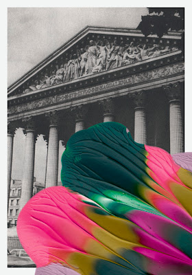
This is a piece by Leslie David a Graphic Designer and Illustrator from France. She grew up in the south of france in a small village called Sauzet. Leslie works for high profile clients across the world and has a very impressive body of work. Her style of work would come under the Landscape category as most of her photographs are of landmarks, streets and buildings. This work was created as a post card, her aim was to make the photograph reminiscent of the horror film Blob from the 1950's. I have chosen to analyse this photograph because it is eye catching and the technique used looks very interesting and creative.
The materials used were fluorescent paint and old postcards. The technique she has used is simply spreading the paint over the postcard to make it look like the colour is over powering the plain black and white post card. I think this is an effective and strange technique by the way it has no structure to it but still serves its purpose. The paint breaks up the normal image sort of like it has been set free. She uses a range of bright colours mixed together such as pink, yellow and green. The choice of colours remind of hippie colours which could represent hippies brightening up boring plain landscapes.
I have chosen this photograph because the technique used and also the whole theme of it interests me and makes me think about what the artist was thinking when creating this piece. My first reaction was quite confusing and I didn't understand what the image was about as it has no structure to it what so ever. I like the way the plain colours clash with the bright colours to create an effect, it looks like the colours are slowly infecting the image and over powering it to make it more exciting. The only thing I dislike about this image is that it is confusing and it is hard to find a meaning behind it or a story behind it. I have never come across an artist that does uses this technique specifically, I have come across certain artists that have the same intention which is to clash colour with plain. Leslie David inspires me with her creativity and technique, I am interesting in looking further into it and also experimenting with it myself.

No comments:
Post a Comment